Hungarian Design Award Winners 2020
Product category
ZIGZAG boulder
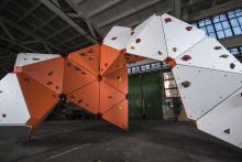
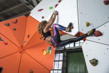
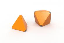
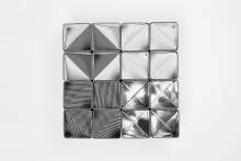
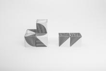
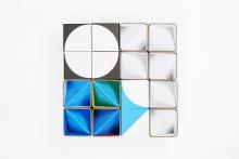
HBH (Hard Body Hang) is a business specialised in the design and production of street workout equipment and accessories. It regards it as its mission to provide the opportunity for local communities to do daily exercise, especially in outdoor parks. Its ZigZag climbing wall can be configured to build geometric systems resembling rock formations: its tetra- and octahedron modules can be combined into numerous spatial formations, both monolithic and uneven, similar to those found in nature. Depending on the angle of incidence the modules can be easily built into simple climbing frames in playgrounds aimed at developing coordination as well as into complex and more difficult walls with overhangs. The number and position of holds can be freely varied and the climbing routes are marked in different colours so climbers know which level of difficulty to choose. The materials are weather-resistant and the assembled climbing walls can be used without ropes and harnesses, while the impact-attenuating flooring provides fall-protection even from three to four metres.
Jury statement
The ZigZag boulder modular wall climbing system was developed through distilling years of experience accumulated by the company HBH (Hard Body Hang), specialised in the production and installation of outdoor workout facilities and equipment. It can be defined as a very fresh, airy and abstract large-scale puzzle which needs to withstand major static and physical wear and tear. And that is exactly where the genius of the design lies: it is light and playful, while being easy to assemble with precision and all this is coupled with outstanding technical features. The other huge value of the system is the abstraction of its forms. HBH boldly altered the organic, highly articulated and complex pattern of rock faces: taking a geometrical approach, the designers chose to develop a system based on tetra- and octahedrons. Virtually all the bouldering problems can be modelled by configuring these elements. The final product has a characteristic appearance lending originality to the system. Moreover, the colours and forms of the accessory elements fit in perfectly with the overall concept. The ZigZag boulder is a world-class example of how design-based thinking coupled with high standard technological content and implementation will result in a high quality, valuable product.
ILLAN suspension lamp
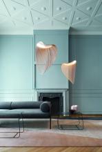
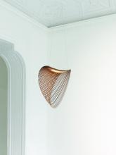
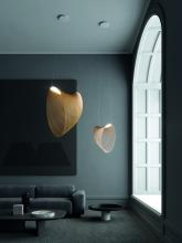
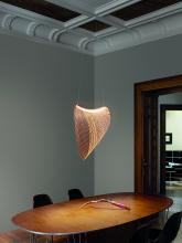
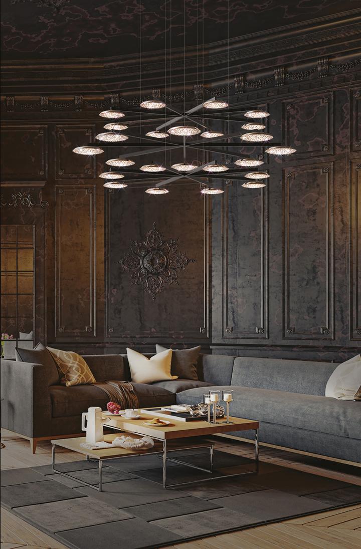
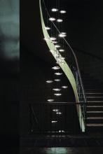
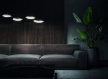
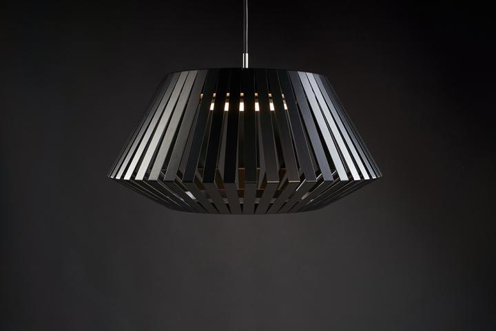
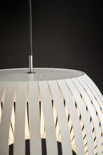
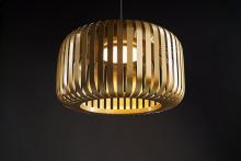
One of the most exciting areas of contemporary design is lamps: besides representing the latest technological inventions, they are typically more than sources of light as they evoke and mediate feelings and atmosphere thanks to the light itself. Illan, which means evanescent, encourages users to live in the moment. The light hanging balancing on the borderline between sculptural space forming and design bends appearance and function harmoniously and poetically. The lamp is equally distinguished by a striving for environmentally conscious manufacturing and technological innovation. When suspended into space the 2D laser-cut plywood form morphs into a kinetic formation, while emphasising the flexibility of the material and the beauty of the wood’s veins, while being ethereal and making delicate moves. The use of the light source is thought through in detail and the warm light reflecting off the wood’s surface produces extremely comfortable and relaxing diffused lighting. The smart application of the wood, which comes from sustainable forestry, makes Illan a unique object of meditative character.
Jury statement
The Illan suspension lamps provide a perfect example of how a unique and spectacular premium product representing high added value can be realised through low energy-intensive implementation coupled with lots of experimentation, environmentally friendly materials and an easily available, minimum-waste production technology. It is exemplary how in recent years the designer has managed to develop the concept of her university degree project into a marketable and competitive product, which she has presented at various international exhibitions and trade fairs and for which she found an internationally acclaimed manufacturer and distributor.
The concept was developed during the designer’s experiments using a laser cutter to make objects with special, flexible birch plywood. When the lamp is suspended, gravity shapes the plywood sheet made up of concentric circles into an exciting sculptural form. Combining the well-chosen material and technology resulted in a flexible and transparent form set into a delicately undulating movement by a gentle breeze. The Illan lamps are manufactured in three sizes and work with power-saving LED lights.
TILT chair and armchair
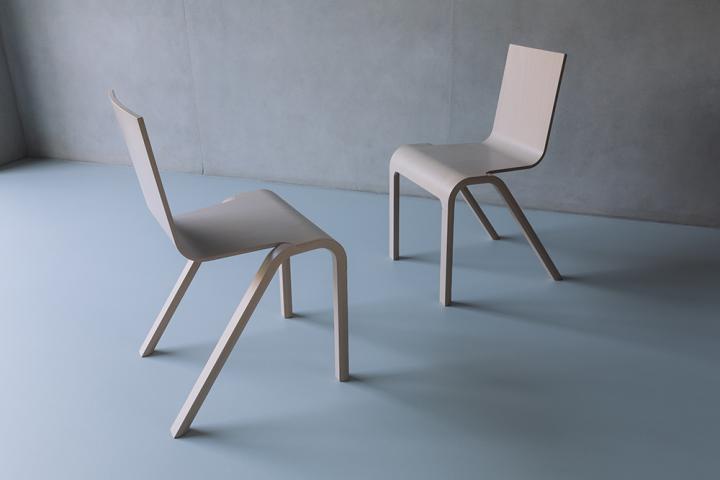
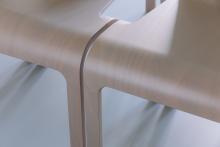
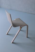
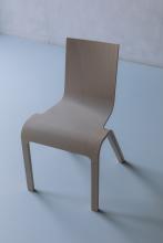
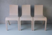
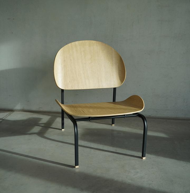
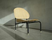
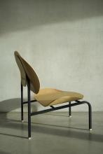
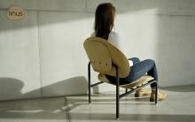
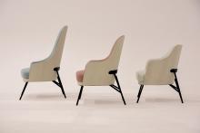
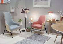
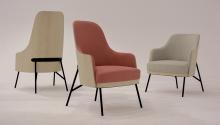
One of the themes regularly addressed by the design profession is how unique value can be created with large-scale industrial production. Ten years ago Dániel Lakos started examining the repetitive aspect of natural elements closely resembling each other (leaves, water drops) and how this could be translated into serial manufactured products. The basic idea of the Tilt collection was inspired by a large volume of chairs at conferences and restaurants: upon seeing these the designer decided to focus not on visual uniformity but rather on tiny alterations that can be observed in nature. During the design process he slightly bent the rectangular backrest of his gently curved chairs and then mirrored it. He created three versions with this method: one that is symmetrical, one slightly tilting to the left and one slightly tilting to the right. Even when arranged into regular rows, these chairs create the impression as if each piece were different from the rest, although only to a minimal degree. The ergonomy of the light and delicate chairs is not affected by the diffrently contoured backrests; moreover, the series meets the requirements of furniture used in public institutions in every regard.
Jury statement
The TILT chair was realised as a product thanks to the support of the College of the National Cultural Fund in 2018. Chair design is a special area. Given the relatively limited scope of domestic production capacity, development opportunities and research it is extremely difficult for seating furniture to become competitive products. In the case of this project it was a good decision to choose the Balaton Furniture Company, which had experience in special bent plywood manufacturing, for the PPA and for the serial production. In regard to the component parts of the chair: the size of the legs, a defining element of the design, was determined with the required load-bearing capacity in mind and to be integrally connected to the seating surface, subtly indicating their static role. The single-element seat-and-backrest unit fitted to the legs has an ergonomically mature design, while the unsupported backrest and the integrity between the seat and the legs maximally exploit the flexible movement inherent in plywood without adversely affecting stability. The excellent end product with an exemplary design is competitive on the domestic and foreign markets alike. The TILT chair was included in the HFDA Budapest Select programme supporting designers to participate in exhibitions. It debuted at the London Design Fair in 2019, and it was simultaneously presented to the Hungarian public at the Salon Budapest exhibition. Expanded into a 9-piece series, the TILT brand appeared at the Maison et Object show in Paris in January 2020. This spring the manufacturer received orders from two public institutions: a monastic order, which will have the chairs in its communal areas, and a museum.
Concept category
BIROSIGN
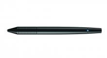
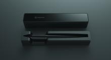
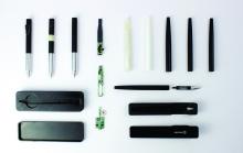
Secure authentication is gaining importance in the digital world but authentication with PIN codes, passwords, face and voice recognition can be easily tricked and forged. Birosign supplements the world famous invention of László Bíró, the ordinary ball-point pen, with a new function by using a new technology, which interprets signatures not as graphic signs but as sequences of digitalised movements. The system analyses the hand’s micro-motoric movement with large resolution sensors and evaluates it with an algorithm, measuring acceleration and the degree of pressure among others; moreover, since an individual’s signature changes over time, it can follow this process too. During the first time the user ’trains’ the pen to recognise and remember the characteristic features of the sequence of movements for the given signee. Based on these data it can identify the user later too. The authenticity of the signature on the documents signed with Birosign and digitally forwarded can be subsequently checked along with the timestamp at any time.
Jury statement
We live in the age of information technology with digital networks having become interwoven into every area of our lives. Being in the online space, however, is not without its dangers, and although they are virtual, they nevertheless pose a threat to our daily lives. The security of our personal data and activities requires fast and reliable ways of authentication but connecting the biological identity of a person with their virtual identity is an ongoing challenge. This became somewhat safer when electronic signatures were introduced, but identifying the user remained an unsolved problem. The electronic pen, called Birosign, provides a solution. It is a classical writing instrument but at the same time, a security tool since it analyses the dynamic behavioural characteristics of the given signature and thus can automatically check the authenticity of the user. The clear and elegant design reinforces the high tech solution, while linking tradition with futureoriented services. Birosign is a digital tool allowing users to have access to the most modern solutions regardless of their qualifications and knowledge. It brings new technology close even to those who are not comfortable with or even weary of the new and unusual objects of the digital age. Birosign is a digital tool for all, combining elegance with cutting edge technology.
LAVOSBALL
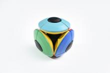
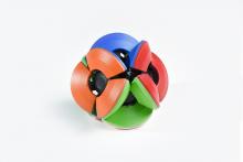
As the designer of LavosBall deals with interior and visual design too, interpreting spatial relations forms an integral part of his day-to-day activity. This puzzle game called LavosBall took more than three and a half years to develop and is aimed at developing spatial vision and spatial thinking. It is related to Rubik’s Cube in several ways but is not based on Descartes’ coordinate system but on that of Leonardo. Instead of three axes at right angles, it is made up of four reels at 120 degrees with each other. It has four discs, each composed of three elements (spinners) of the same size and form, and their position can be changed separately by twisting. The spinners have warm colours on one side and cold colours on the other, and the objective of the game is to create a configuration of same-colour surfaces. While in Rubik’s Cube all the sides are always visible, when playing with LavosBall the player has to simultaneously focus on the visible and the hidden surfaces. In order to solve the puzzle, the player has to get inside the ball by pressing the centre of the reels, as a result of which the spinners are set in motion.
Jury statement
The well thought-through and all-encompassing design makes LavosBall a meaningful form of entertainment for people of all ages. It is a 3D logical puzzle game, where users need to match colours and assemble surfaces of the same colour. Its unique feature is that the four colour discs – which combine into a ball – flip inside-out when the centres of the reels are pressed and thus four new colours During the design process, besides studying Rubik’s cube, the designer also analysed the Hoberman sphere, which is a hexaflexagon with infinite movement, as well as the Epimenides paradox, which demonstrates recursive processes. The combined effect of these can be seen in this puzzle game with an intriguing spatial geometry. Thanks to its stunningly innovative structure, LavosBall not only has discs that can be flipped but it also produces a uniquely dynamic movement when the discs flip around creating the effect of a magician’s trick. This object helps develop logic, spatial vision and colour perception as well as fine manual motor skill. By being immersed in this object and experiencing carefree joy, users are symbolically lifted out from space and time while playing with it.
Designing a logical puzzle game is a huge challenge in the country of Rubik’s cube but we think that the ingenious solutions and attractive appearance of LavosBall make it a worthy successor of the cube invented by Rubik in 1974.
Visual communication category
FIE WORLD FENCING CHAMPIONSHIP 2019 visual identity
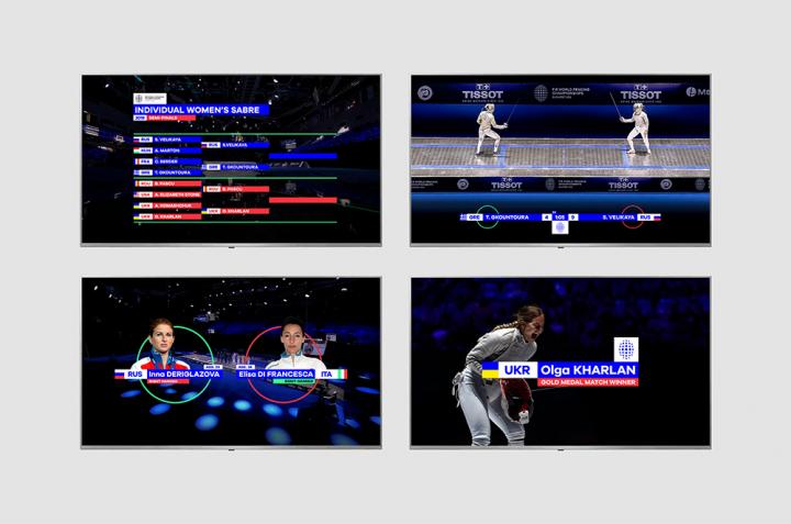
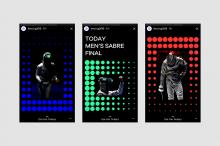
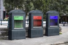
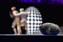
The logo system designed for the international sports event had to meet a complex set of requirements. It had to be an easily identifiable design including cultural codes that can be interpreted globally, while it had to satisfy the requirement of being powerful and recognisable in various sizes – ranging from an inch to several meters in scale – as well as on various surfaces and materials. At the same time the design had to retain integrity. The well thought-through and carefully structured visual identity lives up to all the aforesaid criteria and is easy to adapt to emerging needs. The circle motif as the basic form is a simple and effective choice as it can be easily configured into a complex system by sequencing and developing it into a 3D design. The circle evokes numerous associations and can therefore be easily integrated into the sports event. The identity appears in print on various surfaces but it has to create the same visual intensity on digital devices, such as phones, laptops, televisions screens and displays. To achieve this, the designers developed a responsive system in which the emblem can be flexibly adjusted to the dimensions and resolution of the desired surface in order to provide the fullest user experience.
Jury statement
The project convinced the jury almost immediately thanks to its complexity as well as thoroughly constructed and developed details. The responsive system of the emblem and the retained value of forms make the design easily adaptable to different sizes and surfaces, and at the same time it is easy to understand and identify. The emblem stylises a fencing mask with simplicity and a fresh approach, while also referring to the structure of the world fencing championship. The diverse ellipses of the symbol and the circle in its centre function as a visual reference to the process of becoming a champion. The identity and the supplementary animation reflect the forms of the emblem elegantly yet playfully. The scoreboard animations are composed logically and clearly, thus helping everyone to follow the matches and scores. Overall, this project is impressive with its extremely fresh visual language and its novel animation that draws the eye aptly reflects the spirit of a world competition.
Student category
FOCUS EX browser extension
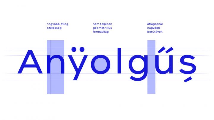
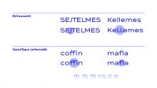
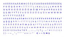
The tool that helps users to read digital texts was primarily designed based on the needs of people with ADHD. Attention Deficit Hyperactivity Disorder is the collective term for a group of neurological symptoms causing much difficulty in everyday functioning. One of the most characteristic symptoms of ADHD is the difficulty to maintain focus, especially during reading. This extension helps filter out distracting factors, divides the textual content and replaces the font settings of the target text with personalised ones, thus enhancing concentration. In this way, instead of fast input, the reader is fed the text gradually, which facilitates a deeper understanding of the content. The font helps the reader thanks to its form, while also providing a new kind of reading experience through its interactivity at the touch of a button. The variable technology allows the customisation of the font size, width, thickness and even focus intensity. In addition, words in the selected text section can be enlarged with a magnifier, thus further enhancing the quality of remembering content.
Jury statement
The development of this programme aimed at supporting the reading of digital texts was preceded by a long period of in-depth research conducted by the designer. The system primarily providing help for people with ADHD was extremely complex to implement and the different functions could only be developed after extensive research. The complexity of the project is confirmed by the customisable font type, which not only assists users thanks to its formal characteristics but also because of its interactive function that can be activated. The fresh graphic interfaces, icons and the presentation homepage designed for the project’s main function guide users and help them understand the digital texts through intuitive visual tools.
The greatest strength of this project, which was designed based on an extremely diverse system of criteria, is that it uses generative typography, which had not been exploited in practice before. It is convincing and commendable that a technological innovation was used in this project in a way that it can be naturally integrated into our visual culture, thus helping users struggling with difficulties.


